Note
Go to the end to download the full example code.
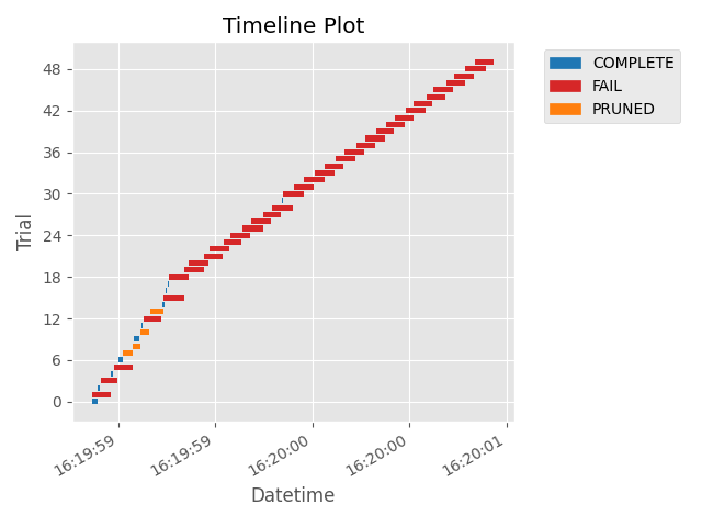
plot_timeline
- optuna.visualization.matplotlib.plot_timeline(study)[source]
スタディのタイムラインをプロットします。
See also
使用例については
optuna.visualization.plot_timeline()を参照してください。- Parameters:
- Returns:
matplotlib.axes.Axesオブジェクト。- Return type:
Note
v3.2.0 で実験的機能として追加されました。今後のバージョンでは予告なくインターフェースが変更される可能性があります。 詳細は https://github.com/optuna/optuna/releases/tag/v3.2.0 を参照してください。
The following code snippet shows how to plot the timeline of a study.
/mnt/nfs-mnj-hot-99-home/mshibata/sandbox/optuna-documentation-plamo-ja/optuna-doc-plamo-translation/tmp-optuna/docs/visualization_matplotlib_examples/optuna.visualization.matplotlib.timeline.py:29: ExperimentalWarning:

plot_timeline is experimental (supported from v3.2.0). The interface can change in the future.


<Axes: title={'center': 'Timeline Plot'}, xlabel='Datetime', ylabel='Trial'>
import time
import optuna


def objective(trial):
    x = trial.suggest_float("x", 0, 1)
    time.sleep(x * 0.1)
    if x > 0.8:
        raise ValueError()
    if x > 0.4:
        raise optuna.TrialPruned()
    return x**2


study = optuna.create_study(direction="minimize")
study.optimize(objective, n_trials=50, n_jobs=2, catch=(ValueError,))

optuna.visualization.matplotlib.plot_timeline(study)
Total running time of the script: (0 minutes 2.287 seconds)