Note
Go to the end to download the full example code.
plot_optimization_history
- optuna.visualization.matplotlib.plot_optimization_history(study, *, target=None, target_name='Objective Value', error_bar=False)[source]
スタディ内の全トライアルの最適化履歴を Matplotlib でプロットします。
See also
使用例については
optuna.visualization.plot_optimization_history()を参照してください。Note
plt.tight_layout()またはplt.savefig(IMAGE_NAME, bbox_inches='tight')を使用して、 プロットのサイズを手動で調整する必要があります。- Parameters:
study (Study | Sequence[Study]) – ターゲット値をプロットする
Studyオブジェクト。 複数のスタディを指定すると、それらの最適化履歴を比較できます。target (Callable[[FrozenTrial], float] | None) –
表示する値を指定する関数。
Noneでstudyが単一目的最適化に使用されている場合、 目的値がプロットされます。Note
studyが多目的最適化に使用されている場合はこの引数を指定します。target_name (str) – 軸ラベルと凡例に表示するターゲット名。
error_bar (bool) – エラーバーを表示するフラグ。
- Returns:
matplotlib.axes.Axesオブジェクト。- Return type:
Note
v2.2.0 で実験的機能として追加されました。新しいバージョンでは予告なく インターフェースが変更される可能性があります。詳細は https://github.com/optuna/optuna/releases/tag/v2.2.0 を参照してください。
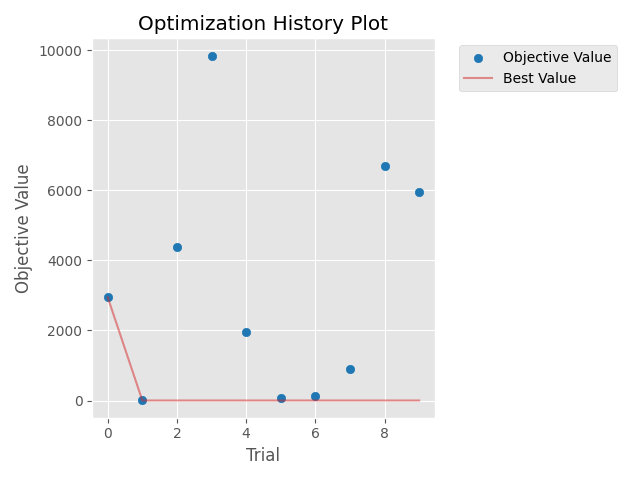
The following code snippet shows how to plot optimization history.
/mnt/nfs-mnj-hot-99-home/mshibata/sandbox/optuna-documentation-plamo-ja/optuna-doc-plamo-translation/tmp-optuna/docs/visualization_matplotlib_examples/optuna.visualization.matplotlib.optimization_history.py:26: ExperimentalWarning:

plot_optimization_history is experimental (supported from v2.2.0). The interface can change in the future.
import optuna
import matplotlib.pyplot as plt


def objective(trial):
    x = trial.suggest_float("x", -100, 100)
    y = trial.suggest_categorical("y", [-1, 0, 1])
    return x**2 + y


sampler = optuna.samplers.TPESampler(seed=10)
study = optuna.create_study(sampler=sampler)
study.optimize(objective, n_trials=10)

optuna.visualization.matplotlib.plot_optimization_history(study)
plt.tight_layout()
Total running time of the script: (0 minutes 0.111 seconds)