Note
Go to the end to download the full example code.
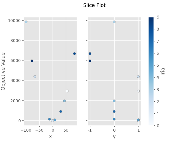
plot_slice
- optuna.visualization.matplotlib.plot_slice(study, params=None, *, target=None, target_name='Objective Value')[source]
Matplotlibを使用してスタディのパラメータ関係をスライスプロットとして描画します。
See also
使用例については
optuna.visualization.plot_slice()を参照してください。- Parameters:
- Returns:
matplotlib.axes.Axesオブジェクト- Return type:
Note
v2.2.0 で実験的機能として追加されました。新しいバージョンでは予告なくインターフェースが変更される可能性があります。 https://github.com/optuna/optuna/releases/tag/v2.2.0 を参照してください。
The following code snippet shows how to plot the parameter relationship as slice plot.
/mnt/nfs-mnj-hot-99-home/mshibata/sandbox/optuna-documentation-plamo-ja/optuna-doc-plamo-translation/tmp-optuna/docs/visualization_matplotlib_examples/optuna.visualization.matplotlib.slice.py:25: ExperimentalWarning:

plot_slice is experimental (supported from v2.2.0). The interface can change in the future.


array([<Axes: xlabel='x', ylabel='Objective Value'>, <Axes: xlabel='y'>],
      dtype=object)
import optuna


def objective(trial):
    x = trial.suggest_float("x", -100, 100)
    y = trial.suggest_categorical("y", [-1, 0, 1])
    return x**2 + y


sampler = optuna.samplers.TPESampler(seed=10)
study = optuna.create_study(sampler=sampler)
study.optimize(objective, n_trials=10)

optuna.visualization.matplotlib.plot_slice(study, params=["x", "y"])
Total running time of the script: (0 minutes 0.106 seconds)